Javascript
Cards animados en 3D Glass Morphism
28 diciembre, 2020
•
7,605 lecturas
Etiquetas:
#Card con HTML y CSS
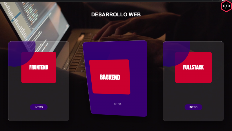
El efecto Glass Morphism este 2021 es probable que se vuelva una tendencia se trata de usar transparencias muy acentuadas con difuminado de border haciendo la comparación con un vidrio. Dicho esto pues veamos este efecto aplicado a una tarjeta
Cards animados en 3d con el efecto Glass Morphism
Veamos como implementarlo con JAVASCRIPT VAINILLA, HTML Y CSS.
La hoja de estilos
    <style>
        body{
            margin: 0;
            background-size: cover;
            display: grid;
            place-items: center;
            font-family: Arial, Helvetica, sans-serif;
            color: white;
            min-height: 100vh;
            perspective: 1000px;
            background-color: tomato;
        }
        .container{
            width: 100%;
            display: flex;
            justify-content: center;
        }
        .card{
            transform-style: preserve-3d;
            background: linear-gradient(rgba(255, 255, 255, 0.1),rgba(255, 255, 255, 0.105));
            border-top: 1px solid rgba(255, 255, 255, 0.5);
            border-left: 1px solid rgba(255, 255, 255, 0.5);
            min-height: 60vh;
            width: 33%;
            margin: 50px;
            border-radius: 20px;
            color: white;
            box-shadow: 0 20px 50px rgba(0, 0, 0, 0.466);
            place-items: center;
            display: grid;
            transition: all 0.75s ease;
        }
        .card::after{
            content: '';
            position: absolute;
            border-radius: 20px;
            top: 0;
            left: 0;
            width: 100%;
            height: 100%;
            background: linear-gradient(rgba(76, 0, 130, 0.726), rgb(19, 0, 128));
            clip-path: circle(30% at 10% 5%);
        }
        .title{
            transition: all 0.75s ease-out;
            font-family: 'Anton', sans-serif;
            background: crimson;
            padding: 50px;
            border-radius: 10px;
        }
        @keyframes animacion {
            0%{ background: rgba(76, 0, 130, 0) ;}
            100%{ background: rgb(76, 0, 130) ;}
        }

        .btn{
            border-radius: 30px;

            background-color: indigo;
            color: white;
            padding: 10px 30px 10px 30px;
            text-decoration: none;
        }
        .contenido__video{
 background: #7DD174;
 overflow: hidden;
 position: fixed;
 top: 0;
 right: 0;
 bottom: 0;
 left: 0;
 z-index: -1;
}
        video {
      object-fit: cover;
      width: 100vw;
      height: 100vh;
      top: 0;
      left: 0;
  }
    </style>
Ahora el Html
<div class="contenido__video">
        <video src="video.mp4" autoplay loop muted >
            <source src="video.mp4" type="video/mp4">
          </video>
    </div>
    <H1>DESARROLLO WEB</H1>
    <div class="container">
        <div class="card">
            <div class="title">
                <h1>FRONTEND </h1>
            </div>
            <a href="" class="btn">INTRO</a>

        </div>
        <div class="card">
            <div class="title">
                <h1>BACKEND </h1>
            </div>
            <a href="" class="btn">INTRO</a>
        </div>
        <div class="card">
            <div class="title">
                <h1>FULLSTACK </h1>
            </div>
            <a href="" class="btn">INTRO</a>
        </div>
    </div>
Finalmente el código Javascript
const container = document.querySelectorAll(".container .card")

        container.forEach(el => {
            el.addEventListener("mousemove",(e)=> {
                let xAxis = (window.innerWidth/2-e.pageX)/15
                let yAxis = (window.innerHeight/2-e.pageY)/15
                el.style.transform =`rotateY(${xAxis}deg) rotateX(${yAxis}deg)`
            })
        })
        //in
        container.forEach(el => {
            el.addEventListener('mouseenter',(e)=>{
                el.style.transition =`all 0.5s ease`
                el.style.animation =`animacion 1.5s forwards`
                el.querySelector(".title").style.transform ="translateZ(150px)"
            })
        })
        //out
        container.forEach(el => {
            el.addEventListener('mouseleave',(e)=>{
                el.style.transition =`all 1.5s ease`
                el.style.animation =`none`
                el.style.transform =`rotateY(0deg) rotateX(0deg)`
                el.querySelector(".title").style.transform ="translateZ(0px)"
            })
        })
Hasta otro tutorial
Recurso del Tutorial
Gratis
173 descargas
Tutoriales Recomendados
Sigue explorando publicaciones de la misma categoría